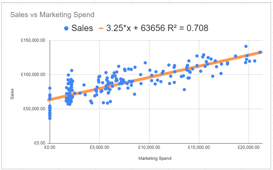
Wondering how marketing spend impacts sales? Use simple linear regression to answer this question.
Imagine you have data on your marketing spend and sales figures. Linear Regression helps you discover the relationship between these variables. It creates a best-fit line that shows how much, on average, sales change with each additional pound spent on marketing.
Step by Step: Linear Regression on Google Sheets
- Select columns with data
- Insert a chart
- Make sure that the chart type is a scatter chart
- Go to Customize >>> Series
- Tick Trend Line
- Adjust Line colour, thickness and opacity
- Use Equation in the Label menu
- Tick Show R squared
Watch the video below for more information on how to create linear regression in Google Sheets.